
A training run prints one loss per epoch, and a column of numbers hides what a picture shows at a glance: whether the model is still learning, has stalled, or has started memorizing. Matplotlib draws that picture. Its module, imported as plt, is the way in.
makes a , the whole image, and an , one plot area with its own scales. You then draw by calling methods on the : for lines, for points, and for counts, for a grid of values. , and tell the reader what they are looking at.
import matplotlib.pyplot as pltimport pandas as pdlog = pd.read_csv('data/training-log.csv', index_col='epoch')fig, ax = plt.subplots()ax.plot(log.index, log['train_loss'], label='train')ax.plot(log.index, log['val_loss'], label='validation')ax.set_xlabel('epoch')ax.set_ylabel('loss')ax.set_title('Train vs validation loss')ax.legend()best = log['val_loss'].idxmin()log
| epoch | train_loss | val_loss |
|---|---|---|
| 1 | 1.86 | 1.87 |
| 2 | 1.42 | 1.48 |
| 3 | 1.07 | 1.18 |
| 4 | 0.86 | 0.99 |
| 5 | 0.7 | 0.83 |
| 6 | 0.58 | 0.76 |
| 7 | 0.49 | 0.71 |
| 8 | 0.43 | 0.72 |
| 9 | 0.38 | 0.73 |
| 10 | 0.34 | 0.78 |
| 11 | 0.32 | 0.85 |
| 12 | 0.29 | 0.92 |
Twelve epochs of a made-up run: the loss on the training data and on held-out validation data.
The stepper shows what each line changed; here is the picture those lines draw, with a dashed line at the lowest validation loss.
import matplotlib.pyplot as plt
import pandas as pd
log = pd.read_csv('data/training-log.csv', index_col='epoch')
fig, ax = plt.subplots(figsize=(6, 3.6), layout='constrained')
# Each drawing call also returns what it drew (a list of lines, a Text);
# the page leaves those out and shows the figure.
ax.plot(log.index, log['train_loss'], label='train')
ax.plot(log.index, log['val_loss'], label='validation')
best = log['val_loss'].idxmin()
ax.axvline(best, color='gray', linestyle='--', label=f'lowest validation (epoch {best})')
ax.set_xlabel('epoch')
ax.set_ylabel('loss')
ax.set_title('Train vs validation loss')
ax.legend()
fig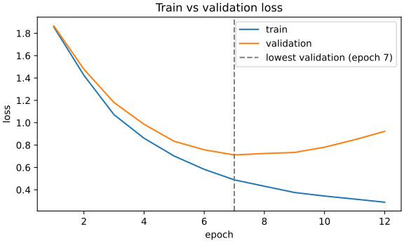
Read it from the left. Both losses fall while the model learns patterns that hold beyond the training data. From epoch 7 the training loss keeps falling, but the validation loss climbs: the model is now fitting the training examples themselves. That is , and the weights worth keeping come from epoch 7.
Matplotlib offers two ways in. In , plt.plot and plt.title act on the current : the one made last, unless plt.sca(ax) picked another. In the , you call the method on the you want, so every line says which plot it changes.
This is where people slip. With two , plt.title lands on the second one, with no error. And an spells the same jobs differently: ax.title is a Text object, not a function, so calling it raises, and the method is .
import matplotlib.pyplot as plt
fig, axs = plt.subplots(1, 2)
axs.shape(2,)# plt.title titles the current Axes, the last one made.
plt.title('train')
[ax.get_title() for ax in axs]['', 'train']# On an Axes, the same jobs are set_ methods.
axs[0].title('train')TypeError: 'Text' object is not callableaxs[0].set_title('train')
[ax.get_title() for ax in axs]['train', 'train']plt.close(fig)Loss often falls fast, then slowly for a long time, and on a linear scale the slow part looks flat. A gives each tenfold drop the same room, so you can see the model is still improving. Asking for two in one row, plt.subplots(1, 2), makes a that shows both side by side.
import matplotlib.pyplot as plt
import numpy as np
# A made-up loss over 500 steps: a power law with a little noise.
rng = np.random.default_rng(0)
step = np.arange(1, 501)
loss = 2.5 * step ** -0.7 * np.exp(rng.normal(0, 0.05, 500))
loss[[0, 99, 499]].round(3)array([2.516, 0.093, 0.033])fig, (left, right) = plt.subplots(1, 2, figsize=(8, 3), layout='constrained')
left.plot(step, loss)
left.set_title('linear')
right.plot(step, loss)
right.set_yscale('log')
right.set_title('log')
left.set_xlabel('step')
right.set_xlabel('step')
left.set_ylabel('loss')
fig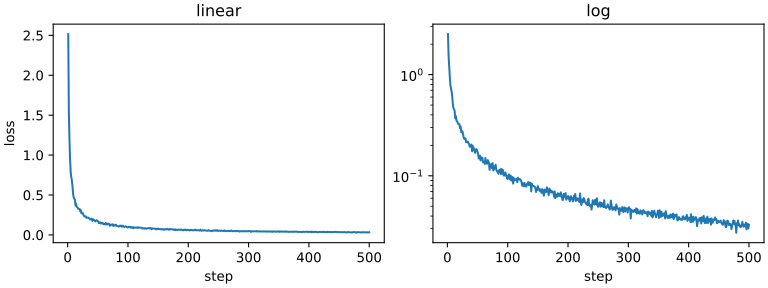
The other plots are one call each. A of predictions against targets shows how close they land, a how the errors spread, a chart the examples per class, and a confusion matrix. A 2×2 returns its as an of (2, 2), so axs[1, 0] is row 1, column 0.
import matplotlib.pyplot as plt
import numpy as np
rng = np.random.default_rng(1)
target = rng.uniform(0, 10, 200)
prediction = target + rng.normal(0, 1, 200)
confusion = np.array([[50, 3, 2], [4, 40, 6], [1, 8, 30]])
fig, axs = plt.subplots(2, 2, figsize=(7, 5.4), layout='constrained')
axs.shape(2, 2)axs[0, 0].scatter(target, prediction, s=6)
axs[0, 0].set_title('scatter: prediction vs target')
axs[0, 1].hist(prediction - target, bins=20)
axs[0, 1].set_title('hist: errors')
axs[1, 0].bar(['cat', 'dog', 'bird'], [120, 80, 30])
axs[1, 0].set_title('bar: examples per class')
axs[1, 1].imshow(confusion)
axs[1, 1].set_title('imshow: confusion matrix')
fig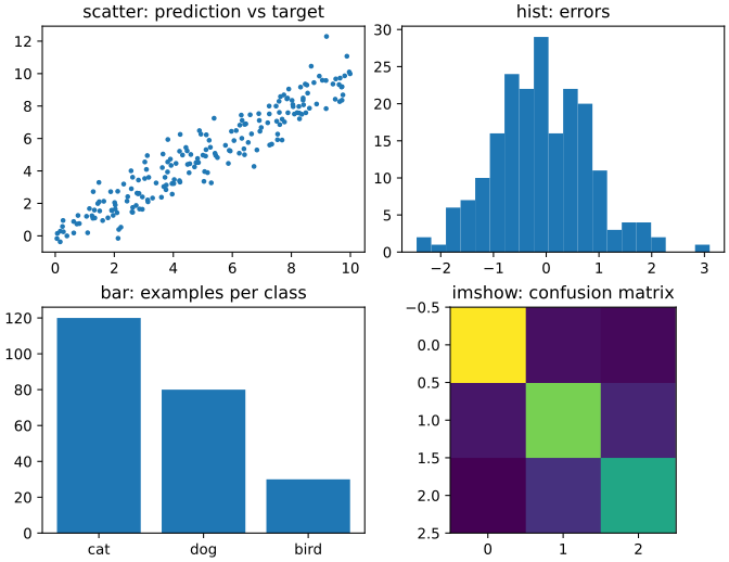
pandas can do the drawing for you. draws one line per column against the , adds a , labels x with the name and returns the . writes the to a file in the format its extension names, so a training script can leave loss.png behind for you to open.
from pathlib import Path
import pandas as pd
log = pd.read_csv('data/training-log.csv', index_col='epoch')
ax = log.plot(title='Train vs validation loss', ylabel='loss')
ax.get_xlabel(), [text.get_text() for text in ax.get_legend().get_texts()]('epoch', ['train_loss', 'val_loss'])ax.figure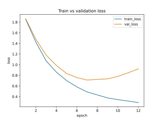
ax.figure.savefig('loss.png', dpi=150)
Path('loss.png').read_bytes()[:4]b'\x89PNG'The habit this chapter adds is to look at the curves before you trust a final number. One loss at the end can’t tell learning from memorizing; two curves side by side can. Give every plot and a , so a saved plot still makes sense when you open it next week.
Homework
The packet has three parts: plot a training log with , a and a , and it as a PNG; label three runs’ loss curves as , underfitting or a learning rate too high; and fix a function whose calls change the wrong .
Chapter 6 workbook
Unzip, follow the README once to set up, then run pytest until it's green.